Share the project
The name
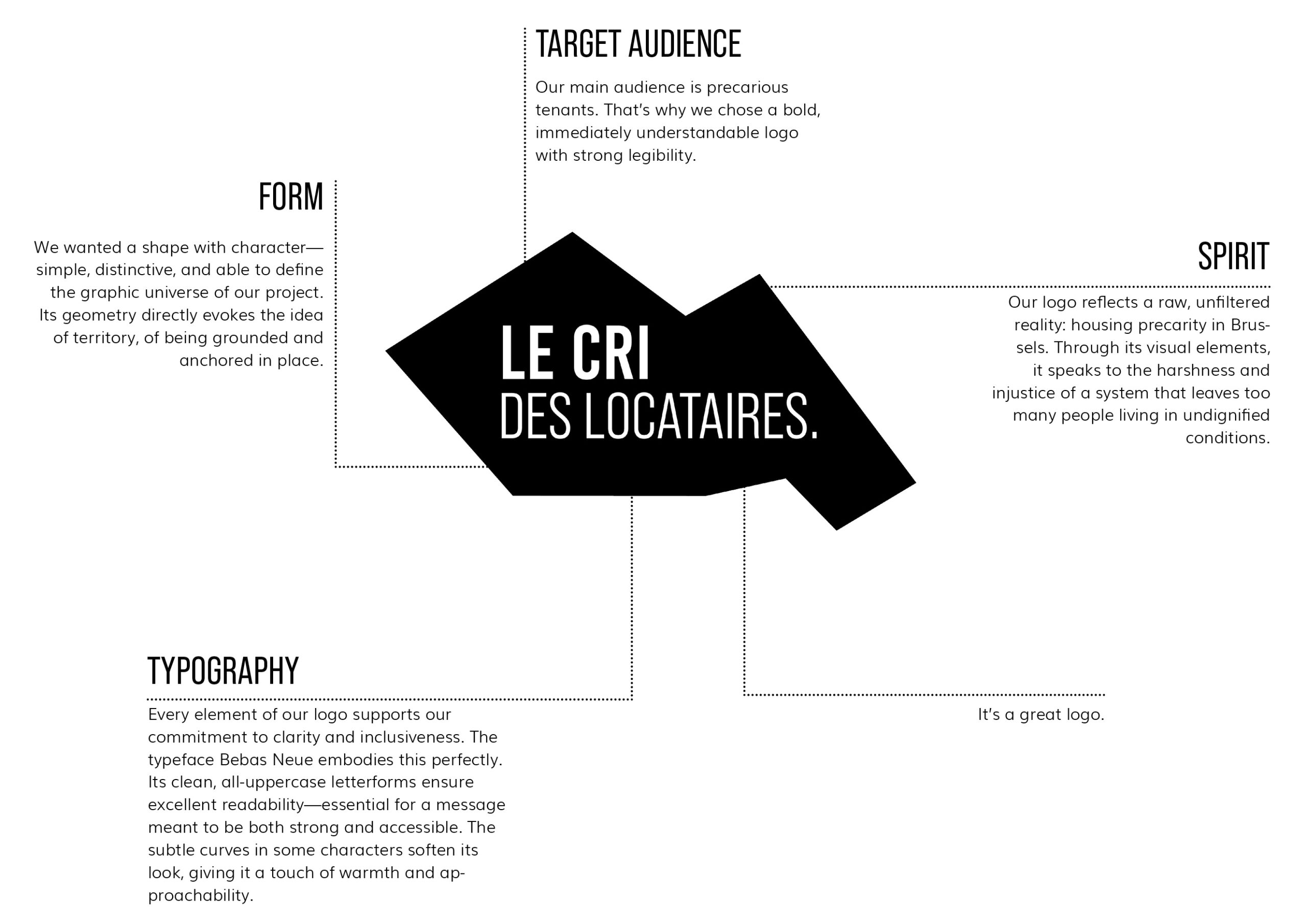
The name ‘Le Cri des Locataires’ (The Tenants’ Cry) reflects both the urgency and the need to make oneself heard in the face of injustices in the Brussels rental market. It symbolises the collective voice of tenants, often invisible, who demand decent housing conditions. Through our website, we want to amplify these voices by providing tools to take action and defend tenants’ rights. It is a call for mobilisation and solidarity for fairer and more accessible housing.
The logo
The colors
Readability and inclusivity
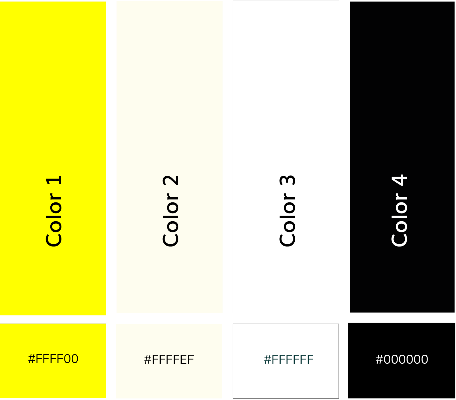
The choice of a minimalist palette of yellow and black, accented with white, follows the same guiding principle: to provide clear and accessible reading while avoiding visual overload. By limiting the palette to a single strong colour accompanied by neutral shades, we ensure a fluid hierarchy of information and better accessibility for everyone. The strong contrast between yellow and black enhances readability, particularly in our media productions.
Furthermore, this choice of colours constitutes a symbolic reappropriation: often associated with movements and discourses contrary to our values, the yellow-black combination is here repurposed to convey a message of social justice and commitment to the right to housing.
Powerful, raw visuals
The bright, almost fluorescent yellow stands out as an eye-catching and powerful colour. It conveys the harshness and brutality of the housing crisis in Brussels while asserting a strong presence in public spaces and the media. Through large areas of yellow, combined with black and white, we create a striking aesthetic that catches the eye and emphasises the importance of the subject.
Fonts
To ensure a visual identity that is both powerful and readable, we have chosen three complementary typefaces.
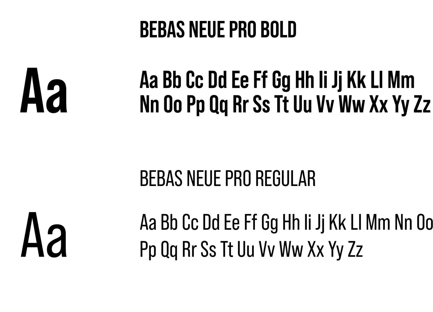
Bebas Neue Pro Bold and Bebas Neue Pro Regular will be used for titles and subtitles.
Open Sans will be used primarily for body text.
Its familiar, balanced design ensures smooth, accessible reading, in line with our commitment to clarity and inclusivity.
All of these typographical choices contribute to strong visual communication that is readable and accessible to all.
